Leonteq AG · 2020
Moneypenny Design System
I created the design foundations, contributed production components and built the documentation that helped eight teams work with one system.
My Role
Design System Lead
Team
4 designers, 4 engineers
Timeline
18 months (v1.0), ongoing
Platform
Vue.js · npm
What I was responsible for
- I started the system from zero and led its development through v1.0 and subsequent releases.
- I designed the semantic tokens and their mapping between Figma and code.
- I contributed Vue components directly to the library alongside the engineering team.
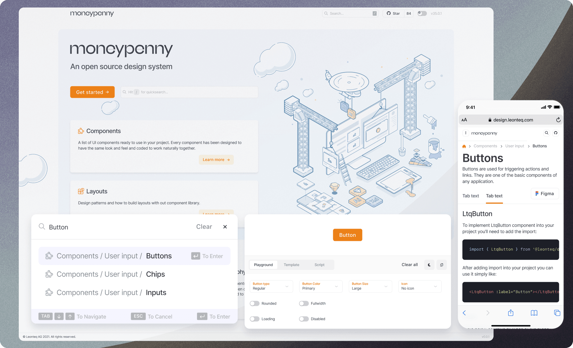
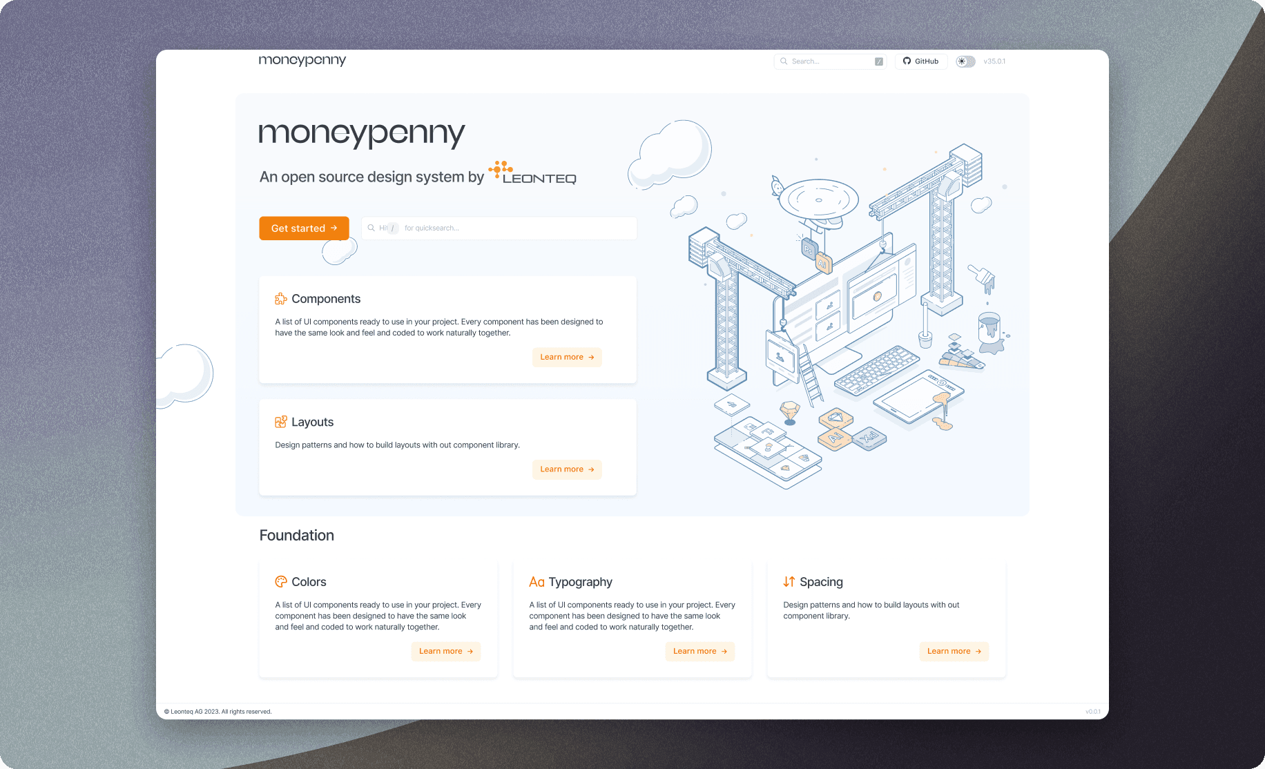
- I designed and built the documentation site, including live property controls, API reference and Figma links.
What I wanted to put right
Across Leonteq’s products, familiar patterns had drifted apart. Teams were maintaining different versions of the same controls, and designers had to learn those differences whenever they moved between products.
I started Moneypenny to give us a shared foundation. I was responsible for the design language and token model, and I contributed directly to the Vue component library. Working in both Figma and code helped me keep the specification close to what the team could ship.
◢Key Insight“I wanted teams to reach for Moneypenny because it helped them do their work.”
◢ Process
- 01
I started with the existing products
The audit covered eight products and more than 1,200 screenshots. It gave me a concrete view of repeated patterns and inconsistencies.
- 02
I designed the foundations
I defined semantic colour, spacing and typography tokens, with a shared mapping between Figma and code.
- 03
I worked in the library
I built Vue components alongside the engineers and created the documentation site with live property controls and Figma links.
- 04
We supported adoption
We worked with each product team during migration and held cross-team sessions to review proposals and contributions.
- 05
I helped shape governance
I pushed for a lightweight RFC process, with versioned releases, visual regression checks and clear migration guidance.
<template>
  <button
    :class="[
      'mp-btn',
      `mp-btn--${variant}`,
      `mp-btn--${size}`,
      { 'mp-btn--loading': loading }
    ]"
    :disabled="disabled || loading"
    v-bind="$attrs"
  >
    <MpSpinner v-if="loading" size="xs" aria-hidden />
    <slot v-else />
  </button>
</template>

<script setup lang="ts">
defineProps<{
  variant?: 'primary' | 'secondary' | 'ghost' | 'danger'
  size?:    'sm' | 'md' | 'lg'
  disabled?: boolean
  loading?:  boolean
}>()
</script>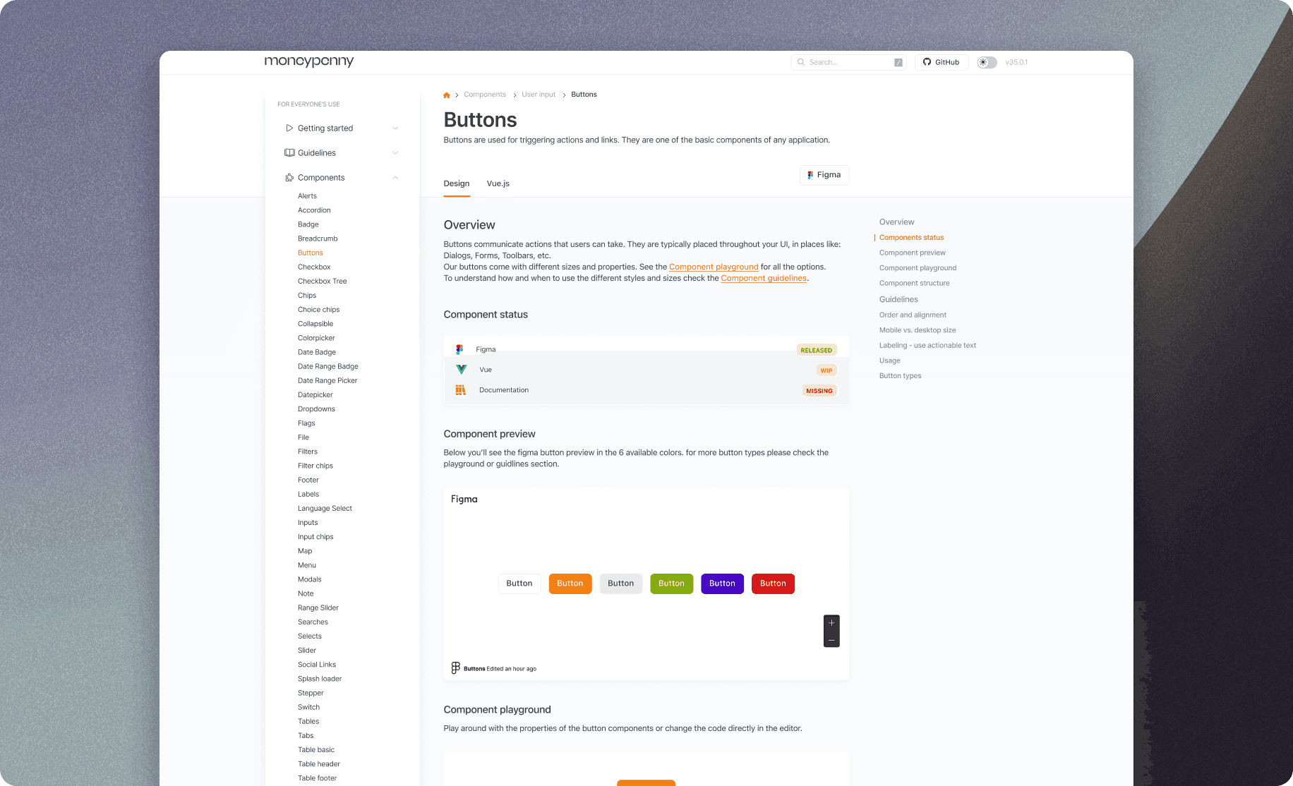
60+ production components. Every variant, state, and interaction documented.
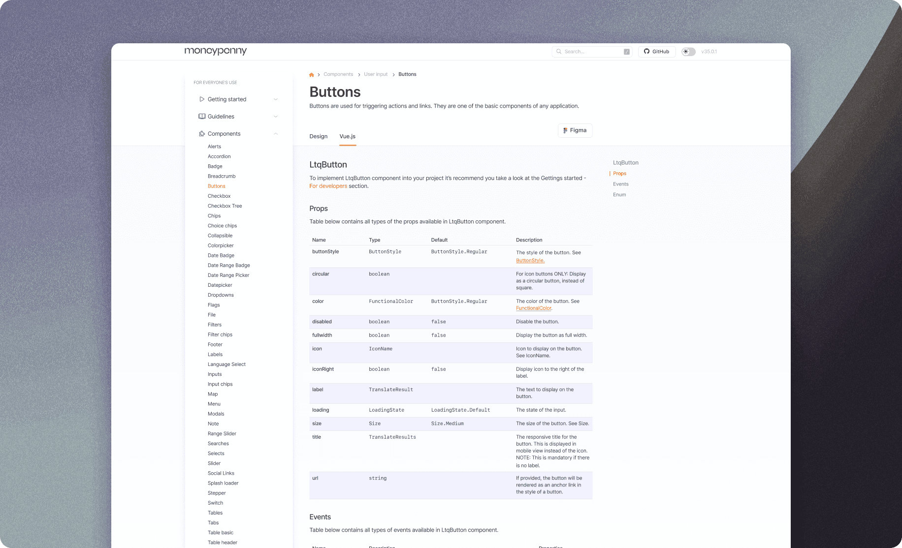
Custom Vue.js documentation site: live prop controls, full API reference, and a direct Figma link on every component page
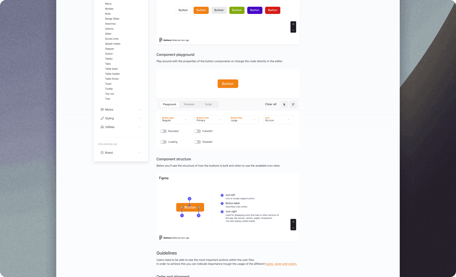
Interactive playground: live prop editing with instant visual feedback, reducing designer-developer back-and-forth.
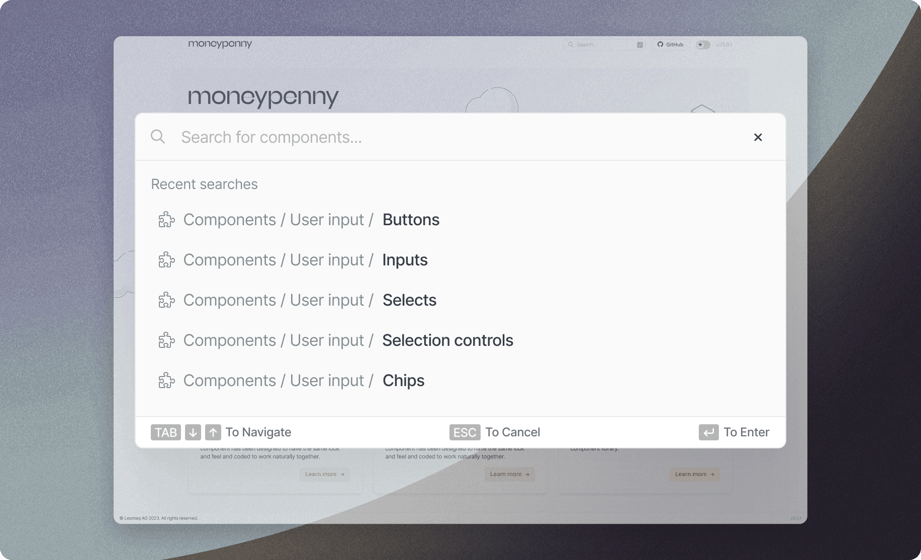
Full-text component search across variants, tokens, and usage guidelines. Instant access to any part of the system.
What changed
Reported project outcomes from the work we delivered.
- 60+
- production components shipped in v1.0
- 8
- product teams migrated in 18 months
- 50%
- faster UI development velocity post-adoption
- 100%
- design-to-code token parity between Figma and Vue
The part that took more than components
I found that adoption needed as much care as the components themselves. A useful system had to give teams a way to propose changes, understand decisions and migrate without stopping their product work.
I pushed for a lightweight proposal process, dedicated maintenance time and shared ownership. We worked with product teams during migration and used regular sessions to review contributions.
I also designed and built the documentation site so people could inspect component properties, find the API and open the corresponding Figma design. I wanted the guidance to be part of using the system, rather than another document people had to chase.